

Introduction
I compare my role as a User Experience (UX) Designer with that of the architect: I think about the (digital) environment we will create, the people who will think, move and behave within that environment, and the way in which the environmental structure will be built. With that, there is a process to guide this effort.
Naturally, we adjust the UX design process in depth and breadth when creating a simple marketing website versus a complex application, but in either case we endeavor to bring the process to bear as much as possible. The following is a general outline of this process, the questions I ask, the tools I use, and the deliverables I produce.
Note to the reader:
In order to adhere to various non-disclosure agreements with my clients, the following examples are from a hypothetical project I created in order to illustrate the process. However, all of the research and work is real—as if it were to be built for real. Investor inquiries are welcome ;-).
1. Kickoff and First Meetings
Everything starts with a conversation. We’ll have a few phone calls, maybe some screen sharing sessions, and we’ll meet in-person if geography allows. The goal of these conversations is to to learn the following:
- What is the purpose of the website or application, and what problem(s) are we going to solve?
- Who will be using the website or application?
- What features and functionality do you envision and why?
- What does success look like?
2. Research
Sometimes, my clients—the stakeholders—have conducted some user research and competitive analysis. Excellent! I’ll study it, and we’ll determine together if there’s a need to expand those efforts and validate further. We may discover new things with a second set of eyes.
Why might this be a good idea?
As an entrepreneur and business owner, I know what it’s like to be so immersed in my project that I miss things that outsiders can see. It’s natural. But it can be expensive when we launch an app based upon our (even knowledgeable) assumptions only to discover later that we solved the wrong problem or didn’t solve it in the best way. I’ve learned this the hard way. In other words, it can be very valuable to step back a bit and take a more objective look at our users and competition.
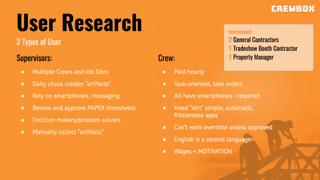
User Research sessions ask things like:
- What are your prospective users’ habits?
- Why do your users do certain things as they relate to your service or product?
- How do your users currently deal with the problems we’ll be trying to solve?
While there are several user research methods, they generally fit into two main types:
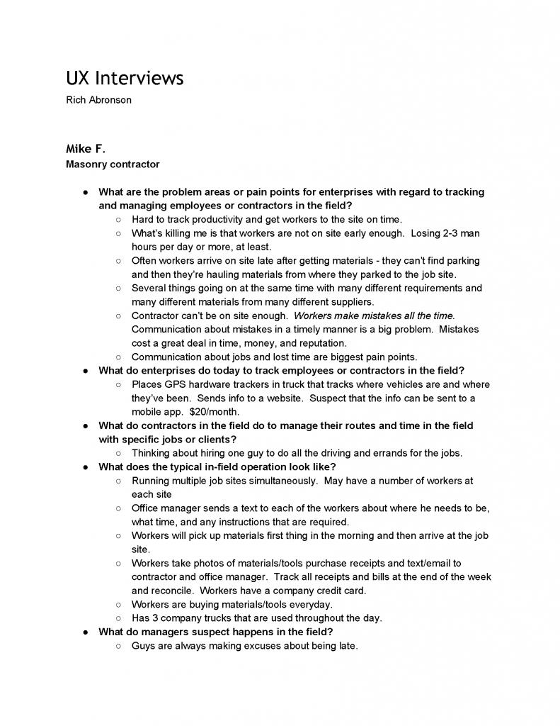
- Interviews. We’ll develop some relevant questions, record the answers, and methodically analyze both qualitatively and quantitatively.
- Observation. We actually watch and record prospective users in their natural environments. We might even conduct some user testing on competitor solutions in order to see how well (or not well) they are serving the users.
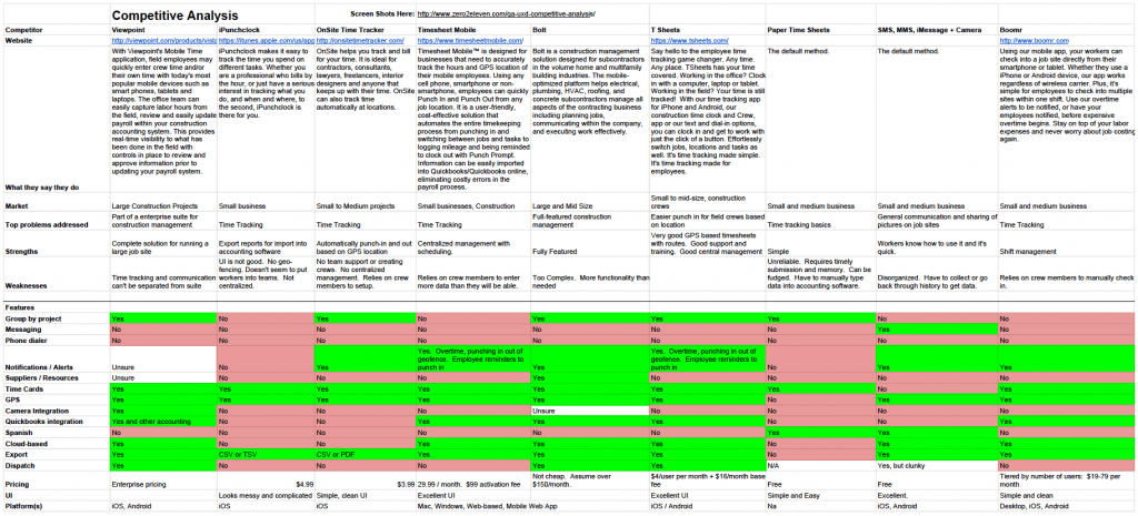
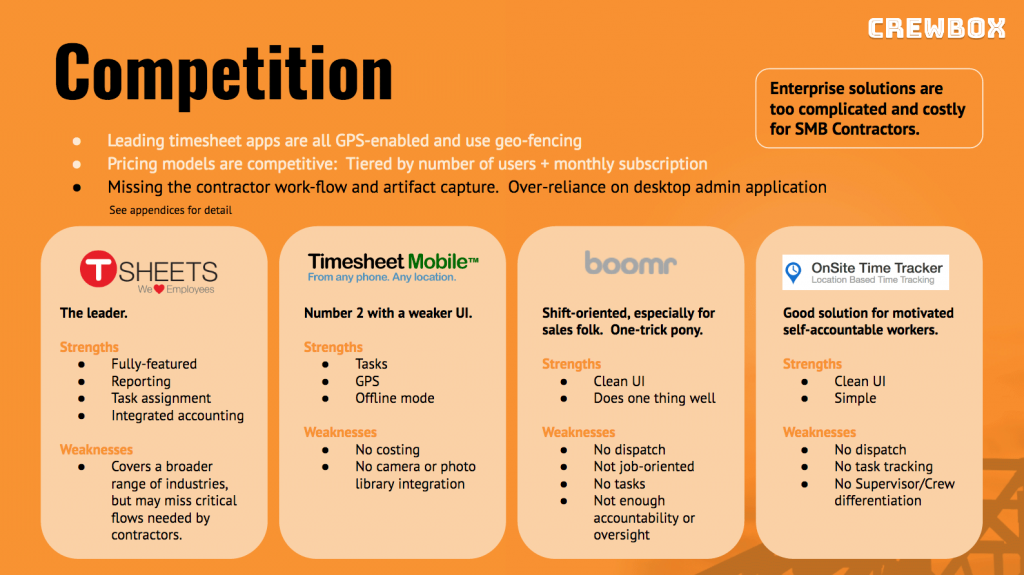
Competitive Research asks things like:
- Who are the competitors from your users’ point-of-view?
- What do competitors do well, and where do they fall short?
- Are there indirect competitors we’ve not considered that are solving similar problems?
The most common competitive research deliverable is a feature matrix, but we risk costly scope creep if we fall into the trap of attempting to reach feature parity. As a hedge, we can more informally or holistically analyze competing solutions in terms of value, what they do well (and not so well), design, ease-of-use, and other criteria.
Deliverables
- User Research Findings Document
- Competitive Research Finding Document
3. Research Synthesis
Now that we’ve collected all this information we need to synthesize it into something concrete.
This process is fairly lightweight for a simple website project, and a basic document that describes the user(s), features, and intended approach will often suffice. Making changes to a WordPress website down the road isn’t the end of the world if we don’t get something perfectly right the first time.
For a more complex application we might want to spend a little more effort up front. It’s easier to edit a document or idea than it is to change code or update a user interface.
At this point, we’ll collaborate on analyzing the research findings and ask ourselves the following:
- What can we take away from our findings and observations?
- What patterns did we find?
We do this by grouping findings into themes and then constructing User Personas, identifying User Goals, and creating User Flows. We explore this further through some rapid prototypes, wireframes, and storyboards.
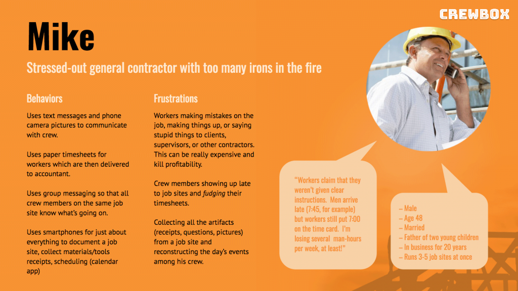
User Personas
The User Persona helps us focus upon whom we’re designing for, and there can be more than one. The persona represents an archetype of our user, his or her goals and needs, motivations, and frustrations. On the flipside, we might also discover that we’re NOT designing for a certain audience or for what we discover is a fringe audience.
In addition, we’ll also create some user scenarios or stories in the context of the project that describe WHAT the user would do and WHY they would do it.
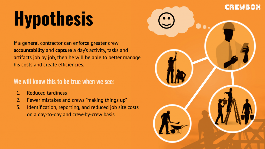
User Goals
Now that we understand our users better we want to more definitively know the user’s goals and develop some proposed solutions that will create value. We’re not quite in the feature specification yet, but we do start making some statements. For example:
Rather than say, “We want to create a tiered, 3-level navigation,” we say instead something like, “How might we help the user navigate a complex catalog hierarchy of products?”
We then write something like:
“We observed that users have difficulty understanding and navigating a complex product catalog hierarchy. We believe that by organizing products into categories and subcategories, and then nesting those categories into a tiered navigation, we can improve the user’s ability to find the products they want.”
Naturally, this is a rather simplistic example, and we’ll use proven best practices where they make sense, but you get the idea.
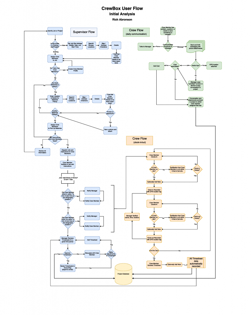
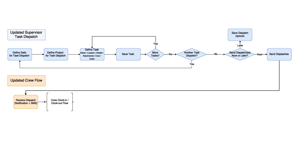
User Flows
At this point, we start creating some user flows. While these may have a 1:1 relationship with the user interface screens, they are more about mapping out the behavior of a user as they achieve the goals our project will enable. We’ll create as many flows for as many user personas and scenarios as necessary to fully understand what we will be designing.
Again, for a simple website we may only need to map out a simple newsletter signup process or using PayPal to purchase a downloadable whitepaper.
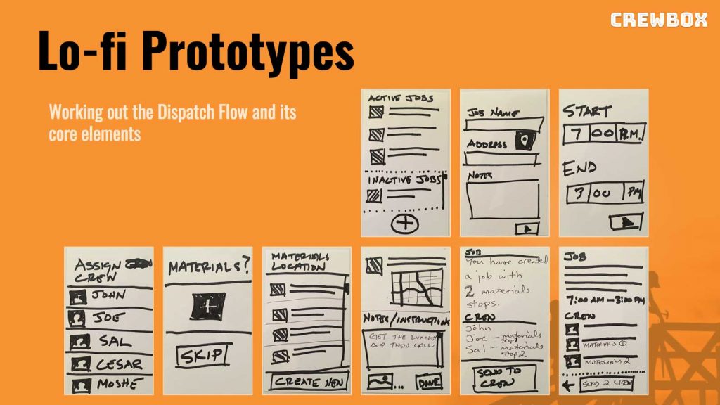
Storyboards, Lo-Fi Wireframes, and Rapid Prototypes
This is often created in concert with creating User Flows, and the effort depends upon complexity. Here, we start representing screens, buttons, and other interface elements with line drawings.
I use two main tools for lo-fidelity wireframes and prototypes:
- Paper
- Balsamiq Mockups
Whether I start with some paper prototypes or jump straight into Balsamiq mockups, I begin by examining how certain key operations, features, or paths through a website or application might be implemented. We can then put these mockups in front of ourselves or a sample of users (or both) and gauge reactions:
- Did they understand it?
- Were they satisfied that they could accomplish their goals?
- Do we need to try something different?
The great thing is that we can rapidly iterate at minimal cost, and we get a really good sense of what kinds of features should be considered for the final product.

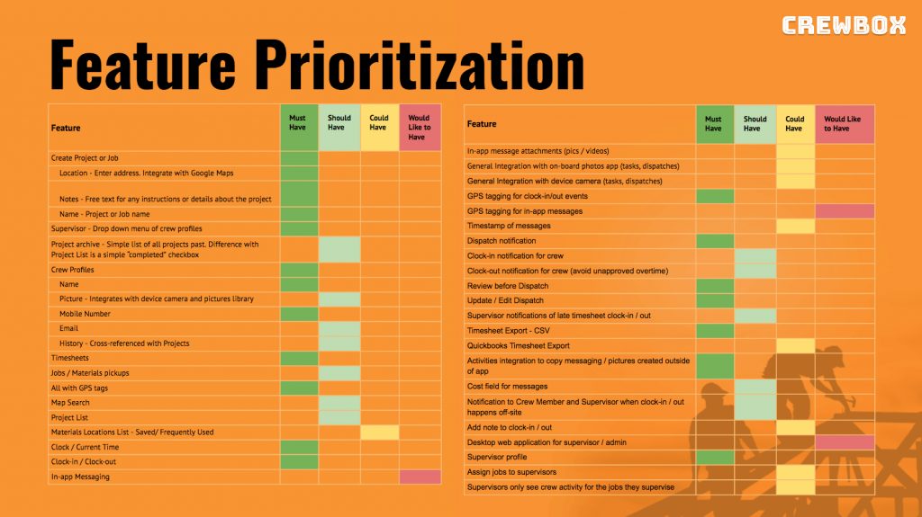
4. Feature Prioritization
As we’ve been synthesizing the research and creating some simple, lo-fidelity prototypes, we’ve also been developing a list of features for our website or application.
Feature prioritization is another collaborative effort. We gather together (virtually or in-person) and build our complete wish list of features and functionality.
Now, it’s important that we get realistic about this in the context of time, budget and resources. In other words, it won’t make sense to build 20 features of which 80% of our users will only use 5.
Defining the Minimally Viable Product (MVP)
This is the buzz-acronym of the decade: MVP.
It basically means that we build only what we can afford within our constraints AND that provides VALUE to the users we’ve identified in our research. In fact, I’ve also heard MVP defined as the Minimally Valuable Product. In other words, the 80-20 rule is operative here.
How do we determine the MVP and the feature-set that defines it?
There are a number of methods for prioritizing features, and they often involves Post-It Notes and a whiteboard. For instance, we might create a matrix according to some criteria like effort vs. user impact, or we might get all the stakeholders together and do some voting.
For example, the stakeholders may collectively come up with 40 different features, but we know that we can only build 10 of them. Each stakeholder gets to vote for 5 features based on how well he or she thinks that feature will solve the problem(s) we originally defined. The 10 features with the most votes go into the MVP—after some additional discussion, naturally.
There are other methods as well, and we might choose 2 or 3 methods and see if we end up with similar results.
Deliverables
- Prioritized Feature List
- Basic Functional Specification (if necessary)
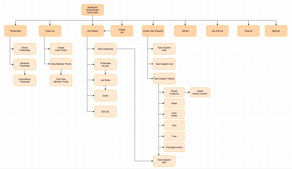
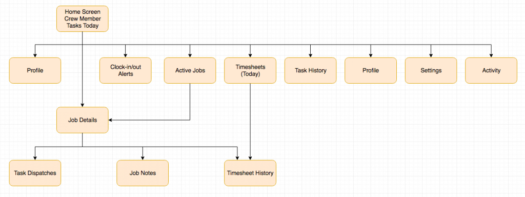
5. Information Architecture, Content and Navigation
At this point, we’ve created a clearer picture describing what’s going into the website or application. Now, we need to give it some structure in the form of the following deliverables:
- Sitemaps
- Navigation
- Content Inventory
For just about any project, simple or complex, a good sitemap illustrating the hierarchy and flow of all the screens is essential. With that, our navigation takes shape, and we are better able to make a full inventory of the content we have, what we need, and where it will exist in the final website or application.
If the project is content-heavy then we’ll create a Content Inventory document. This guides the client so they can collect and write articles or marketing copy, gather or contract artwork and photography, and produce audio or video content.
If search engines and social media will play an important role in attracting traffic then we might recommend working with writers and content producers who are well-versed in SEO and social media strategies.
Deliverables
- Sitemaps
- Navigation
- Content Inventory
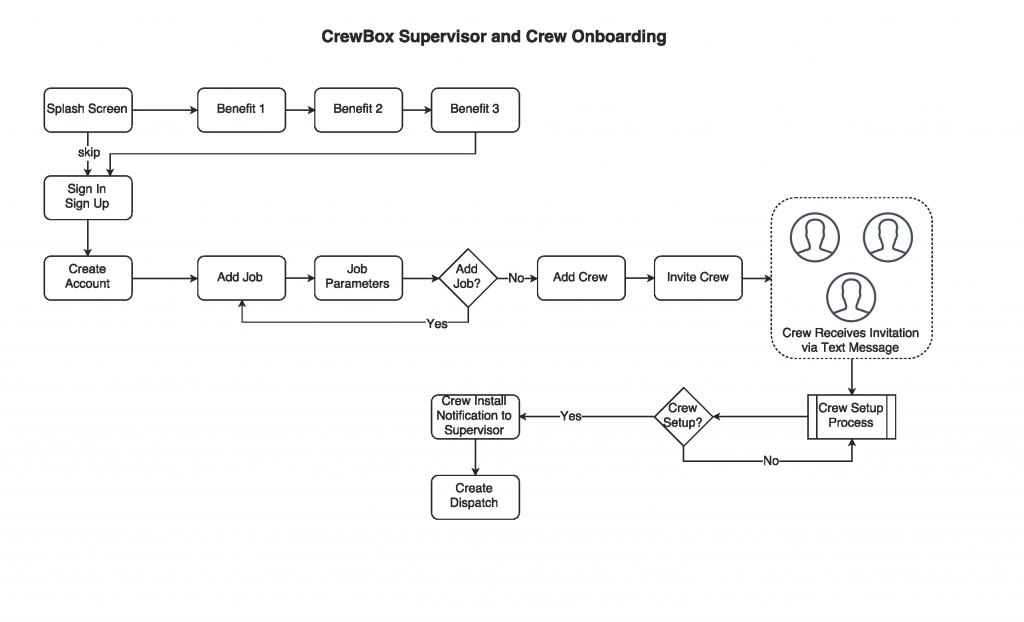
6. Wireframes, Usability Testing, and High(er)-fidelity Prototypes
This is actually one of my favorite parts of the entire process, and it’s where our website or application begins to take a real form.
For a less complex website we’ll wireframe a few key screens such as the homepage, product page, category page, or articles. For an ecommerce implementation we’ll go a little deeper and include the checkout flow, account screens, sidebars, and other key screens.
For a complex application we’ll need to create clickable wireframes representing the majority of what the user will see. I’ll use Balsamiq Mockups so that we can rapidly iterate, but equally importantly, we will use the wireframes to do some Usability Testing to make sure we’re getting it right.
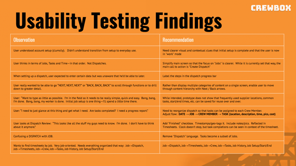
Usability Testing
Usability is defined as how easy and pleasant the features of our website or application are to use.
I can’t understate the importance of conducting usability tests with real users, and this can make the difference between staying on budget or blowing the budget sky high. For a marketing website we might not need to do much of this, and some cursory feedback from friends, colleagues, and potential users might suffice. For more complex projects, it’s crucial.
Much is written about the benefits and methods for Usability Testing, and I learned much of what I know from workshops with the world’s leading expert on the subject, Jakob Neilsen.
In practice, Usability Testing can be fascinating, and we can often uncover most problems after only a handful of user tests. At the end of the day, we are seeking answers to the following:
- How easy is it for users to accomplish tasks?
- How efficiently can users perform tasks?
- Can users remember how to accomplish tasks when they return?
- What kinds of errors do users make, and how easily can they remedy them?
- Does the user have a pleasing and satisfying experience?
We observe behavior, take notes, record the sessions, and then iterate on the wireframes until we are satisfied. In fact, we may only need a couple of usability sessions on the wireframes before we move on to higher fidelity prototypes.
Deliverables
- Complete Clickable Wireframes
- Usability Testing Plan
- Usability Tests, Observations, Recommendations
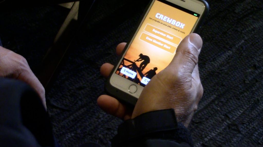
7. High-Fidelity Prototypes
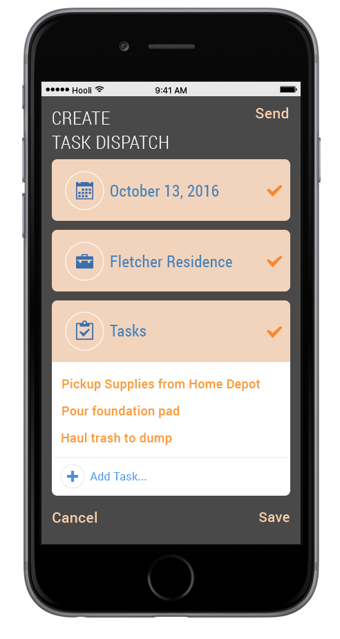
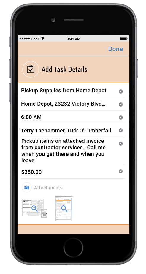
We’ll probably skip this step for simple marketing websites and jump into visual design, but for more complex applications we’ll want to express our wireframes with greater detail and realistic (if mock) content. This is what we call Hi-fidelity Prototyping.
While there’s no backend code or engineering, we design screens to look and behave as if they are real—a prototype. They might not yet reflect the final visual design or branding, but a hi-fidelity prototype enables us to fine tune the user-experience, conduct more nuanced usability tests, and provide visual designers and engineers with a working blueprint for the final product.
Typically, these prototypes are created in an application called InVision.

8. Visual Design
This is the last step in the UX design process before we hand everything off to the engineers. In fact, the engineers may have already gotten started by using the prototypes as their guide. Visual designers generate pixel-perfect designs in Sketch or Photoshop (or both) that include all the colors, styling, typography, and branding elements for the final app or website.
Sometimes, the UX designer does the visual design, but not always. A client may have an outside or in-house visual designer who will use the prototypes and wireframes to guide their design efforts.
In addition, the pixel-perfect composites (or comps) might only include a few key screens, and the front-end coders who do the HTML, CSS and javascript (or iOS and Android engineers using other tools) follow these designs (and the prototypes) to generate the final product.
9. Production and Launch
Production is fairly straight forward at this point. We know exactly what we are building, how it will work, and what it will look like. If I’m doing the production then we might have settled on using WordPress, a Bootstrap theme, or a hosted ecommerce platform like Shopify or Woocommerce. If we’re building an iOS or Android app, or we’re building something that requires some heavy engineering then I’m able to work with outside developers.
Launch
The launch of a native mobile application or intensively engineered application is typically out of my hands, but I remain available to consult when needed. Often, there a number of moving parts including the marketing and on-boarding strategy, submission to the app stores, and other tasks.
For a simpler website project we will have been building in a protected, non-public environment. We’ll do some basic SEO work using best practices, redirect old links (in the case of a redesign), proof and test the site for errors or typos, and when we’re ready we will make the site visible to the public and to the search engines.